Dark-Bahamut-Zero
1.3K
Watchers686 Deviations175.5K
PageviewsCollections

All
18979 deviations
Featured
687 deviations

People and Animals
1727 deviations

Landscapes, Nature, Still Life
2548 deviations

Tolkien
741 deviations
Marvel
2448 deviations

DC Comics
492 deviations
Final Fantasy
870 deviations
Kingdom Hearts and Tomb Raider
169 deviations

Tangled
405 deviations

The Little Mermaid
496 deviations
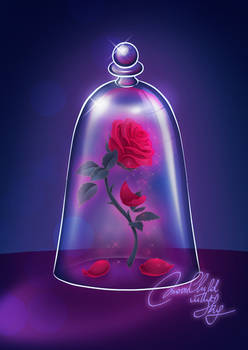
Beauty and the Beast
256 deviations

Frozen
408 deviations
Brave
99 deviations
Mulan
167 deviations

Pocahontas
110 deviations
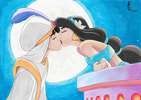
Aladdin
158 deviations

Sleeping Beauty
177 deviations

Cinderella
75 deviations
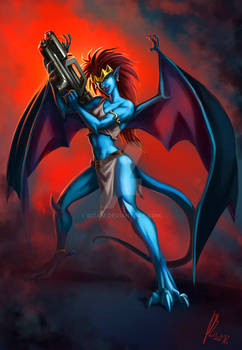
Gargoyles
94 deviations

Mighty Ducks
15 deviations
The Princess and the Frog
65 deviations
Snow White
102 deviations

Disney and Pixar
592 deviations
Ghibli Fanart
214 deviations

TMNT
137 deviations

Cartoons Comics
202 deviations
Movies, TV, Books and Games
272 deviations

Sherlock
129 deviations

Anime Manga
376 deviations
Naruto
3928 deviations

Inuyasha
269 deviations
![[AI] Vegeta's hair problem](https://images-wixmp-ed30a86b8c4ca887773594c2.wixmp.com/f/b6219b59-06b5-4341-b668-59bb87ef3753/dfugg06-fa28ae39-876a-46f7-8dae-3f799dc26759.png/v1/crop/w_234,h_350,x_0,y_0,scl_0.42572463768116,q_70,strp/_ai__vegeta_s_hair_problem_by_rioboy_daydreamer_dfugg06-350t.jpg?token=eyJ0eXAiOiJKV1QiLCJhbGciOiJIUzI1NiJ9.eyJzdWIiOiJ1cm46YXBwOjdlMGQxODg5ODIyNjQzNzNhNWYwZDQxNWVhMGQyNmUwIiwiaXNzIjoidXJuOmFwcDo3ZTBkMTg4OTgyMjY0MzczYTVmMGQ0MTVlYTBkMjZlMCIsIm9iaiI6W1t7ImhlaWdodCI6Ijw9ODI0IiwicGF0aCI6IlwvZlwvYjYyMTliNTktMDZiNS00MzQxLWI2NjgtNTliYjg3ZWYzNzUzXC9kZnVnZzA2LWZhMjhhZTM5LTg3NmEtNDZmNy04ZGFlLTNmNzk5ZGMyNjc1OS5wbmciLCJ3aWR0aCI6Ijw9NTUyIn1dXSwiYXVkIjpbInVybjpzZXJ2aWNlOmltYWdlLm9wZXJhdGlvbnMiXX0.UTZdmAU9UqAhkQCzCq9UiA7CanYpIZAaVlcNbWdp8ow)
DBZ
553 deviations

Cool Random Things
551 deviations
Use of the colour wheel for lighting and shading
I want to talk about some simple things that even professional photomanipulators don't give enough attention sometimes.
It's the reason why our work can be perceived as wrong a bit , especially by traditional artists. People who are not artists usually say “something's wrong”
Our theme for today is colour of light and shadow.
I want to point out – there are many colour schemes and rules for that (it would be better to write an individual tutorial on that),
some are better for realistic works, some for surrealism, some for abstraction etc. It depends on your idea.
Tutorials, Brushes, and Other Resources
26 deviations
Colored Line-arts
11 deviations


